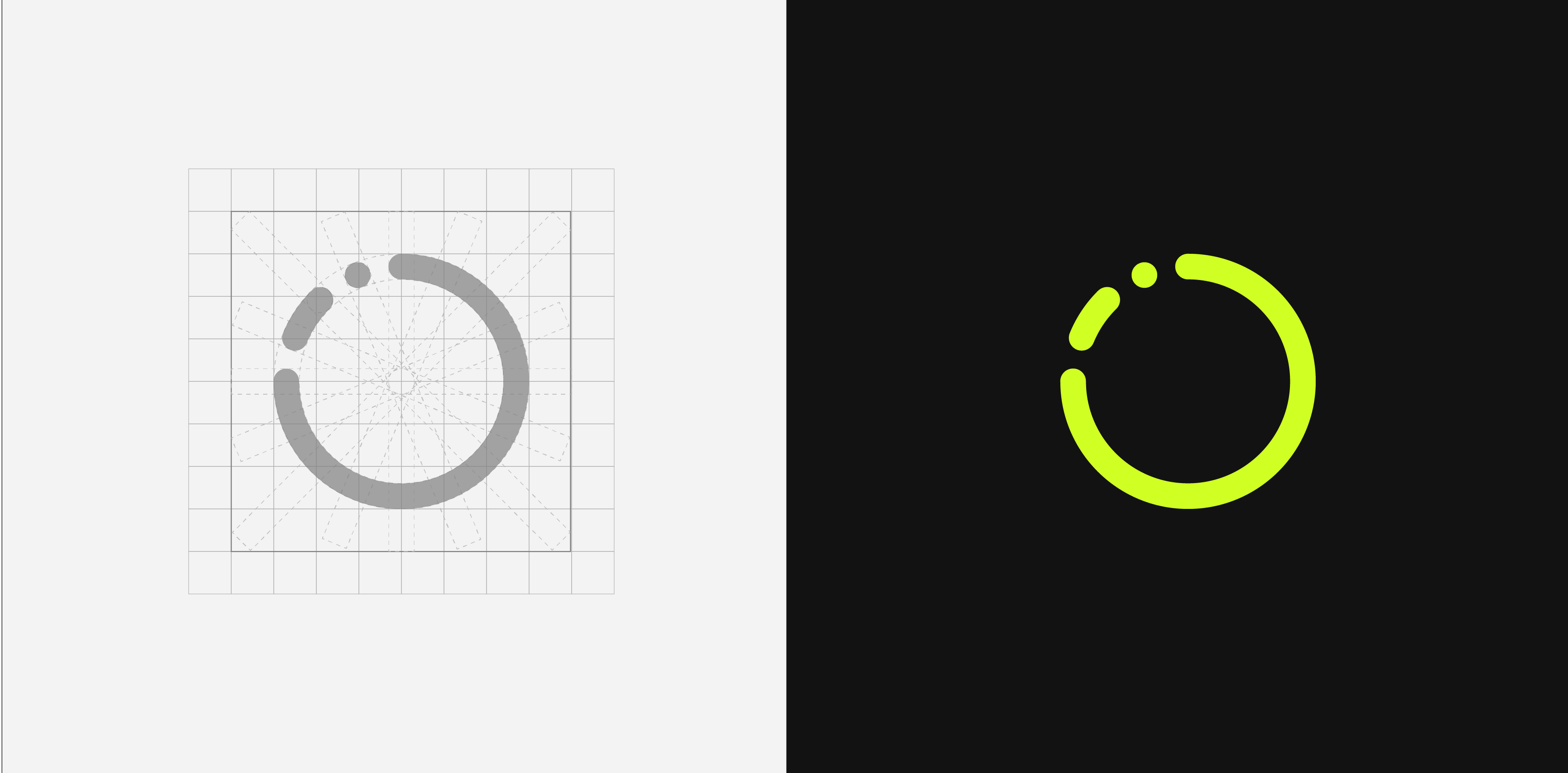
The logo is built around flow, rhythm, and continuous movement. The name suggests motion and circulation, so a broken circle became the mark — energy and progression rather than a static symbol.
Brand Identity · UI Concept
Health Tracking App Branding & UI Concept
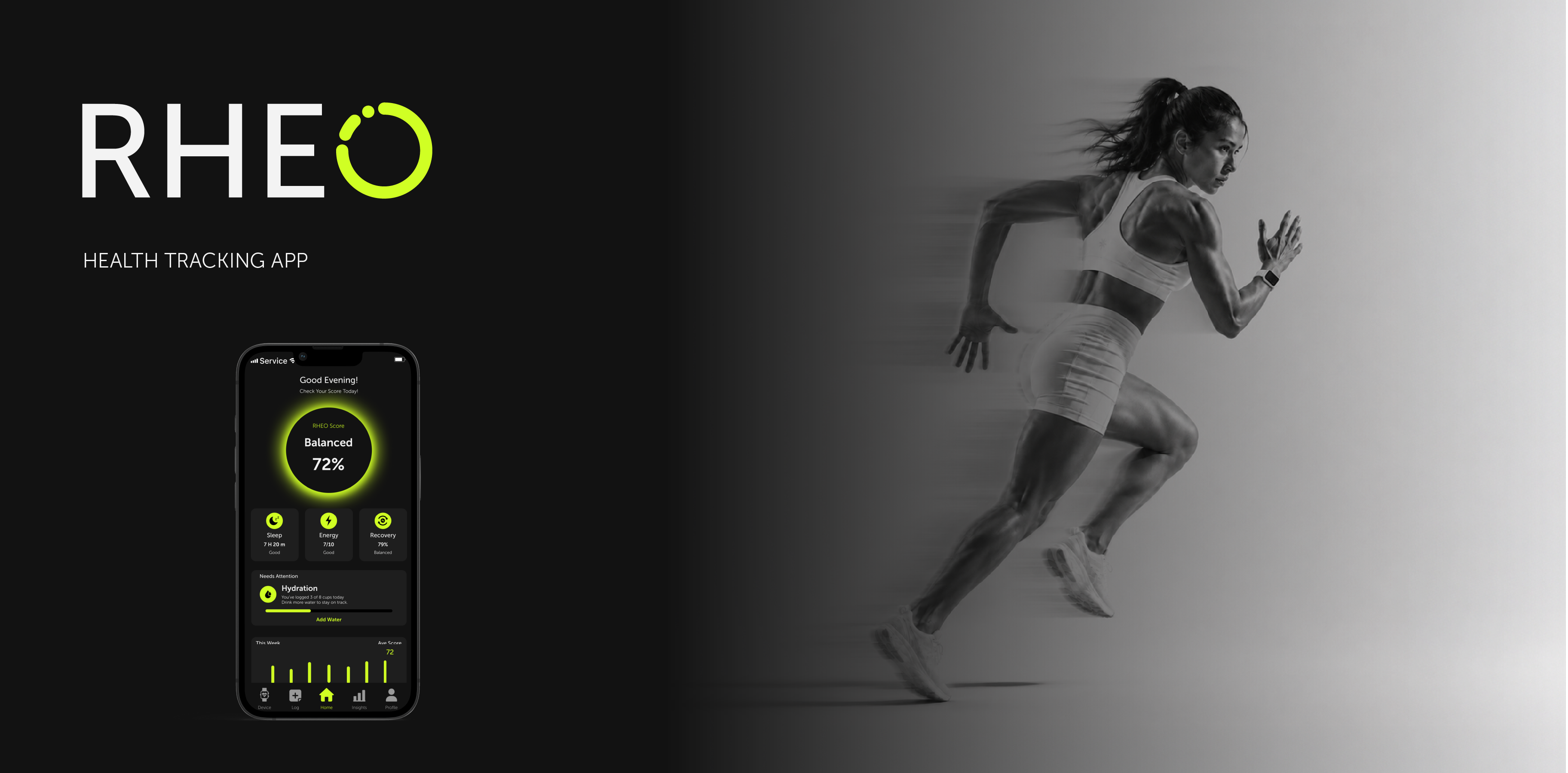
A bold, high-contrast brand identity and mobile UI concept for a health-tracking app, built to help active people read their body, movement, and daily performance.
2 WK
Concept sprint
1 System
Brand & UI Foundation
2 Signal Groups
Activity & Recovery
DARK MODE
Interface direction
Challenge
Design a health-tracking identity that felt energetic, focused, and distinct from the soft wellness language common in the category.
What I did
Built a dark-mode visual system, logo direction, and mobile UI concept around motion, body signals, rhythm, and real-time health feedback.
Outcome
A bold product identity and interface direction that turns health data into a sharper, more confident daily tracking experience.
01
Challenges
1
Body data can feel disconnected from real experience
Tracking apps show numbers for sleep, recovery, hydration, and activity, but those numbers rarely help users understand how their body actually feels in motion.
2
The visual language needed to feel bold, not clinical
RHEO had to move away from soft wellness aesthetics and cold medical dashboards, energetic, clear, and tied to movement, while staying easy to read.
Product vision
A health identity built around motion energetic and confident, where the design itself signals rhythm, circulation, and body signals changing through the day.

02
Brand Identity
This is some text inside of a div block.
Logo construction
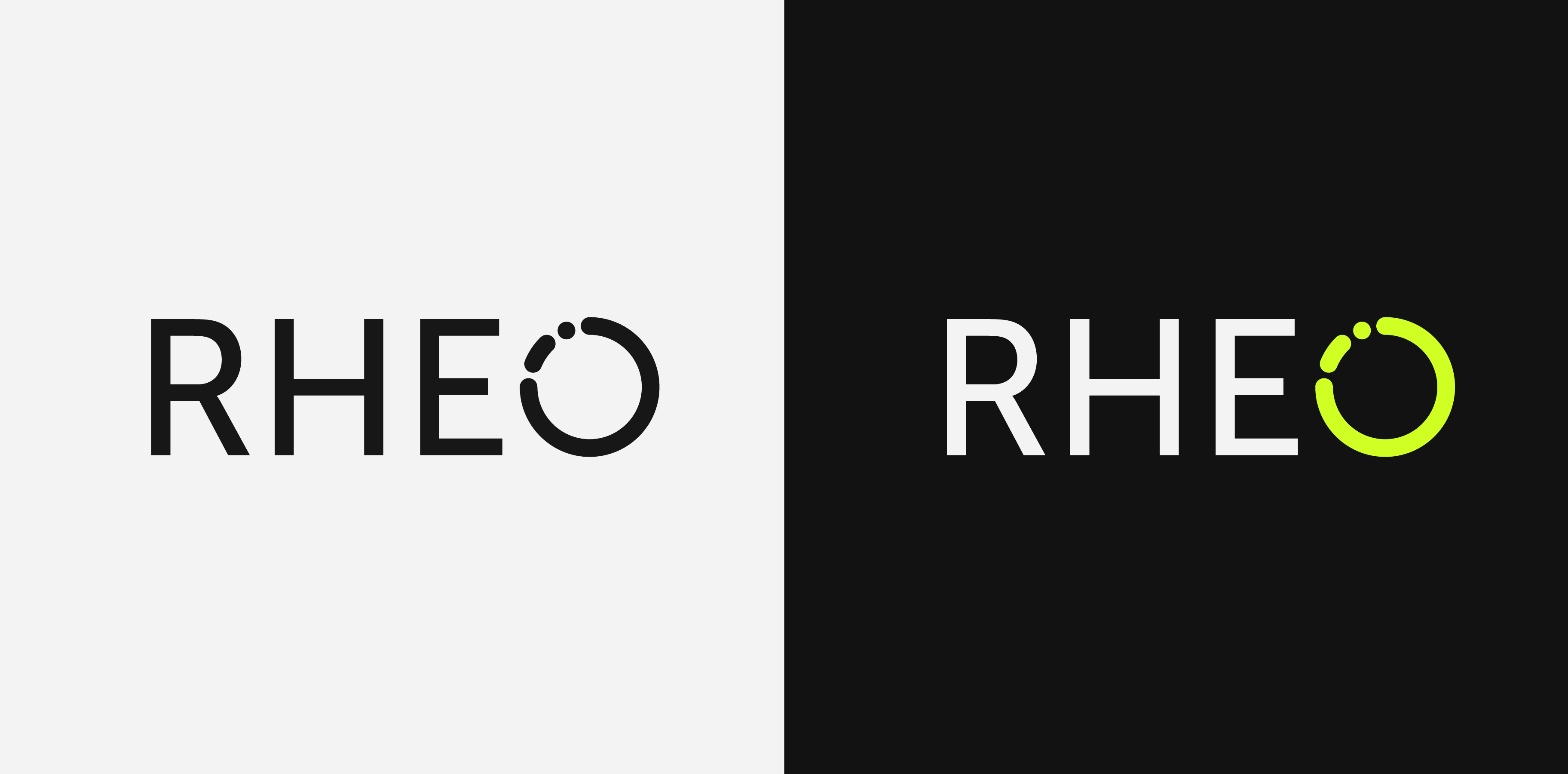
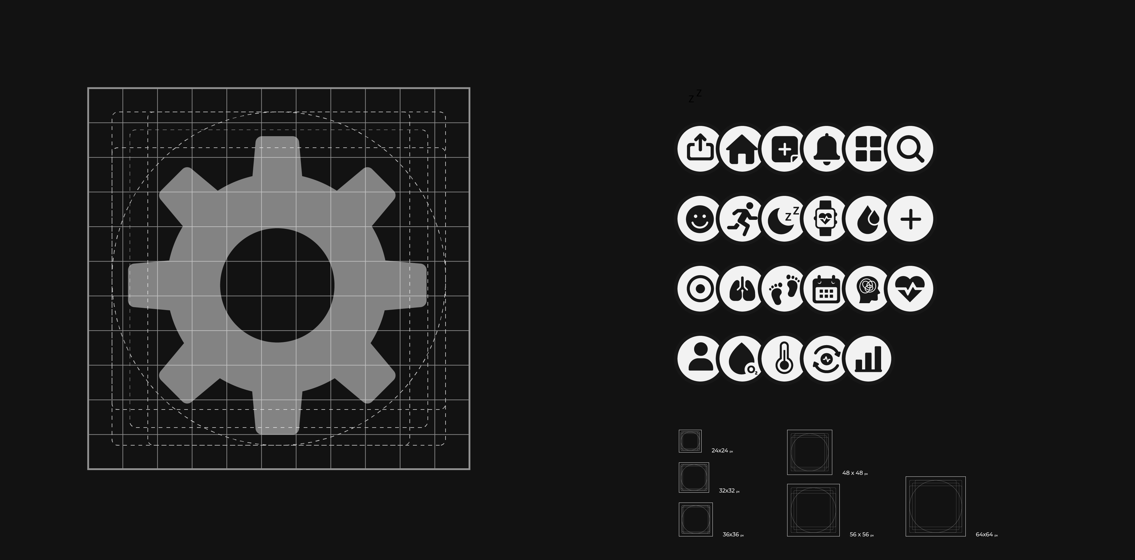
The mark was refined on a geometric grid to stay balanced, scalable, and consistent — simple enough to work as logo, app icon, and interface element while keeping the feeling of motion.
This is some text inside of a div block.
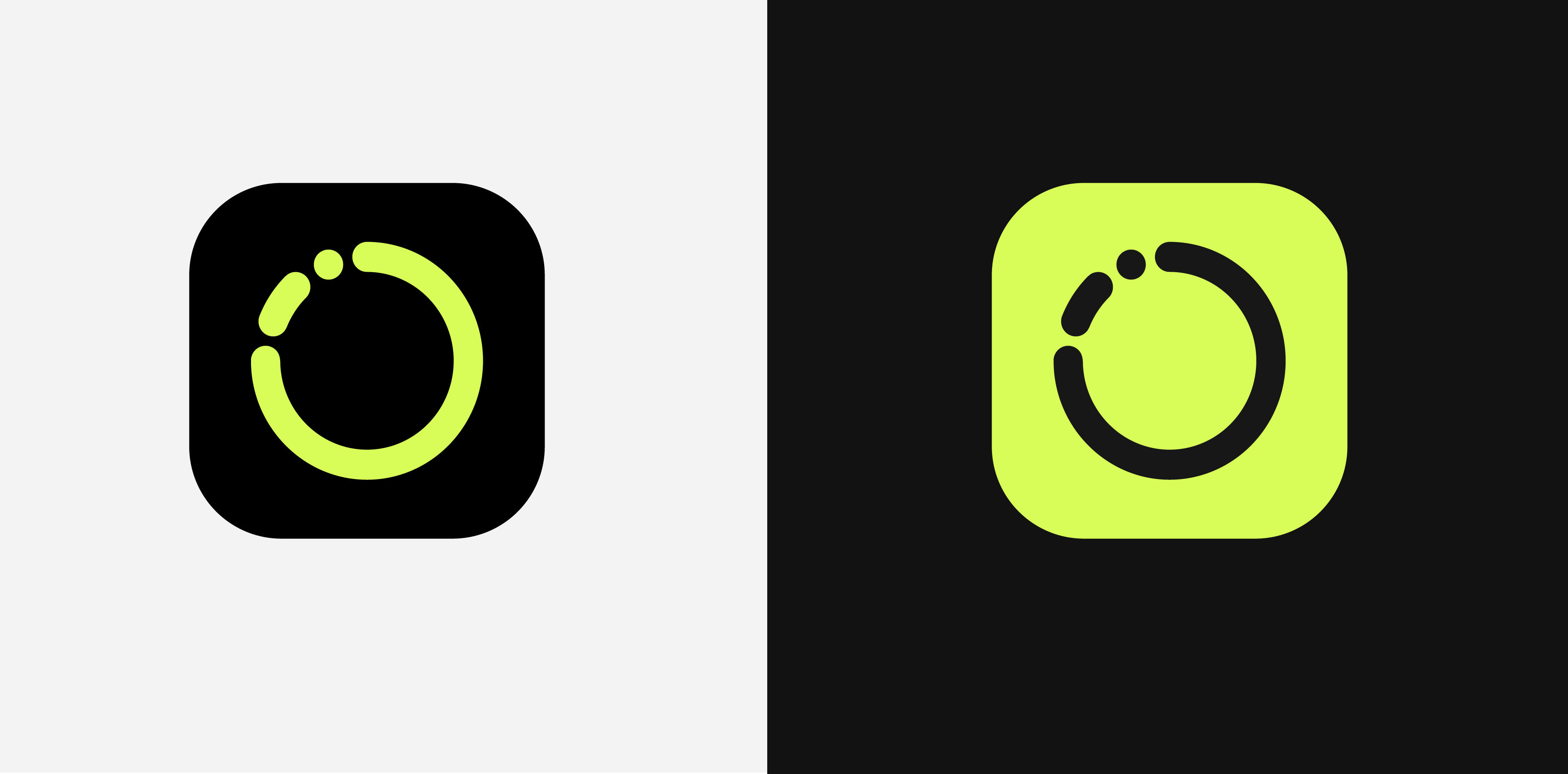
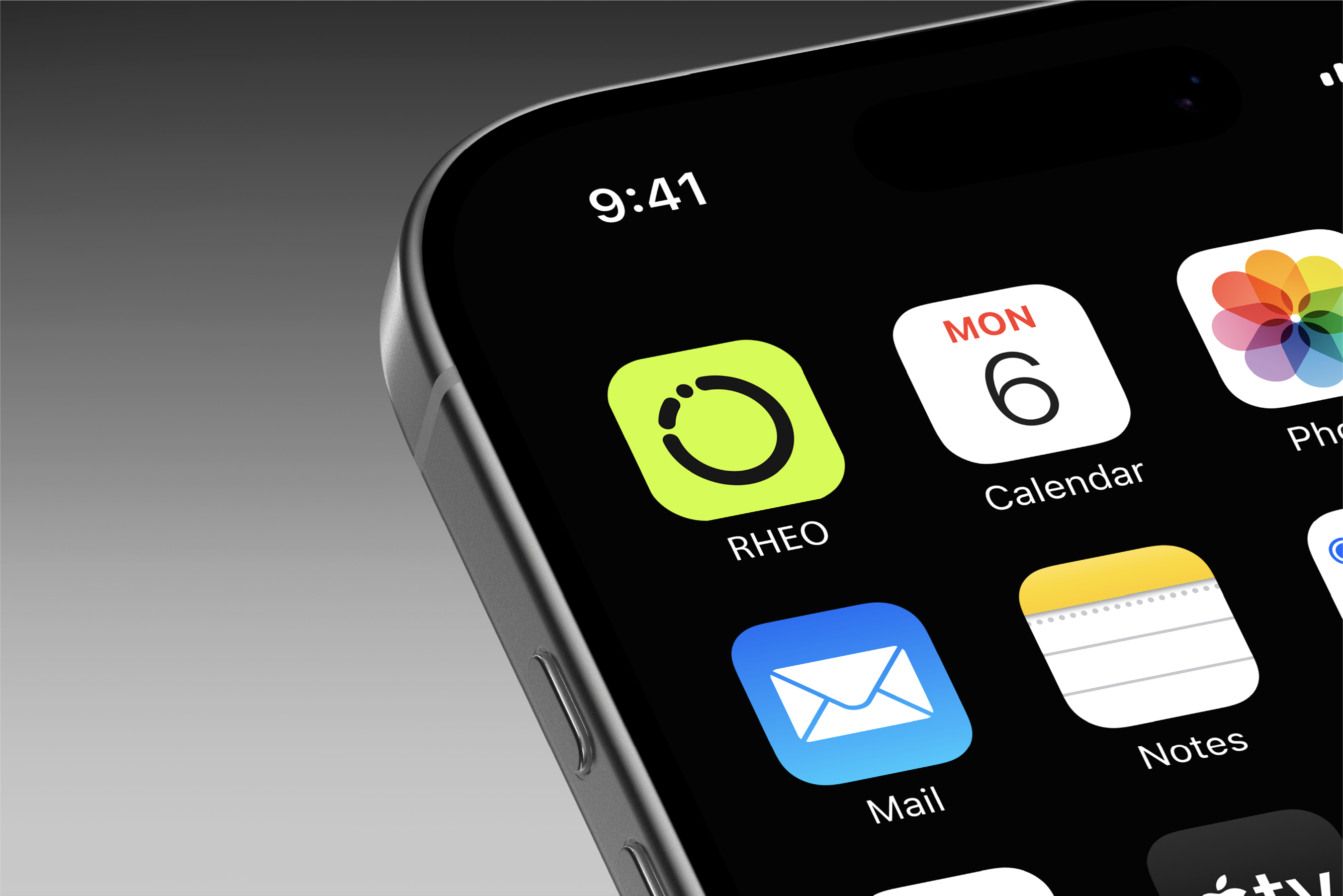
A high-contrast app icon designed for instant
recognition.
This is some text inside of a div block.
This is some text inside of a div block.
03
Visual system
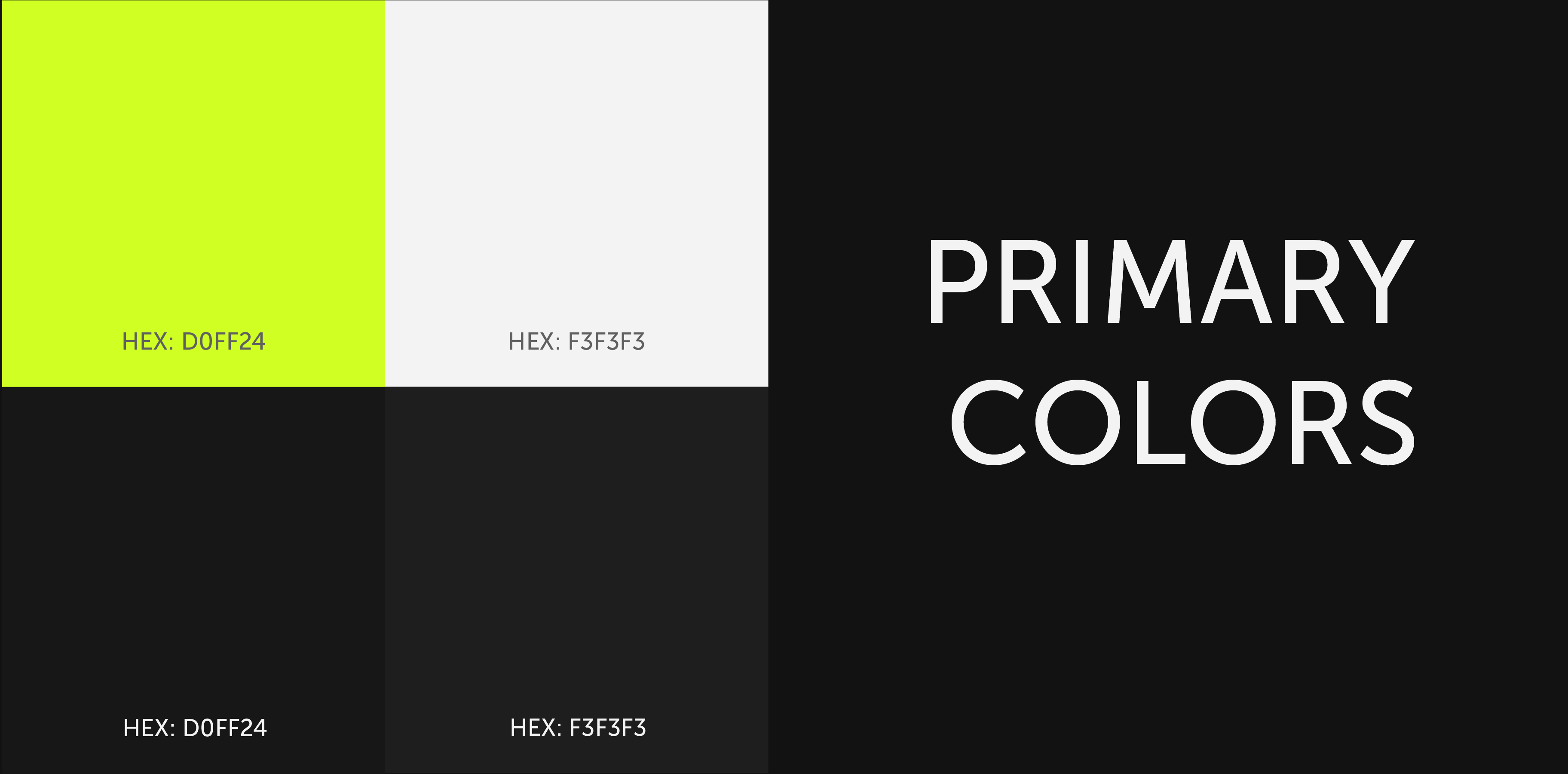
The palette is built on high contrast. Black creates a focused digital environment, white supports readability, and neon green is the signal — guiding attention to key actions, scores, and health indicators.
This is some text inside of a div block.
Typography
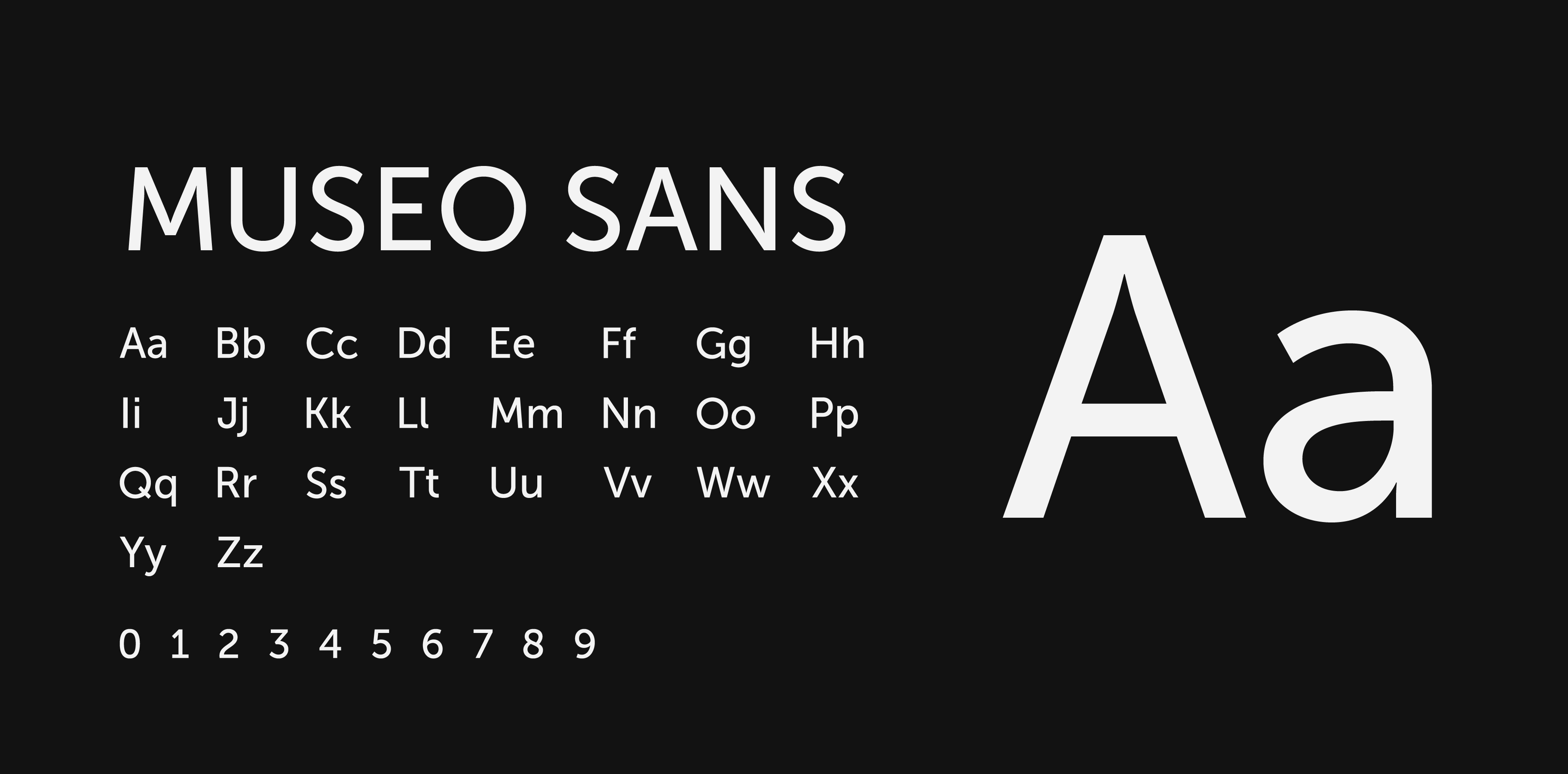
Museo Sans — clean, modern, and geometric. Its rounded forms echo the circular identity, and its strong readability suits health data, dashboard labels, and mobile UI.
This is some text inside of a div block.
04
UI concept
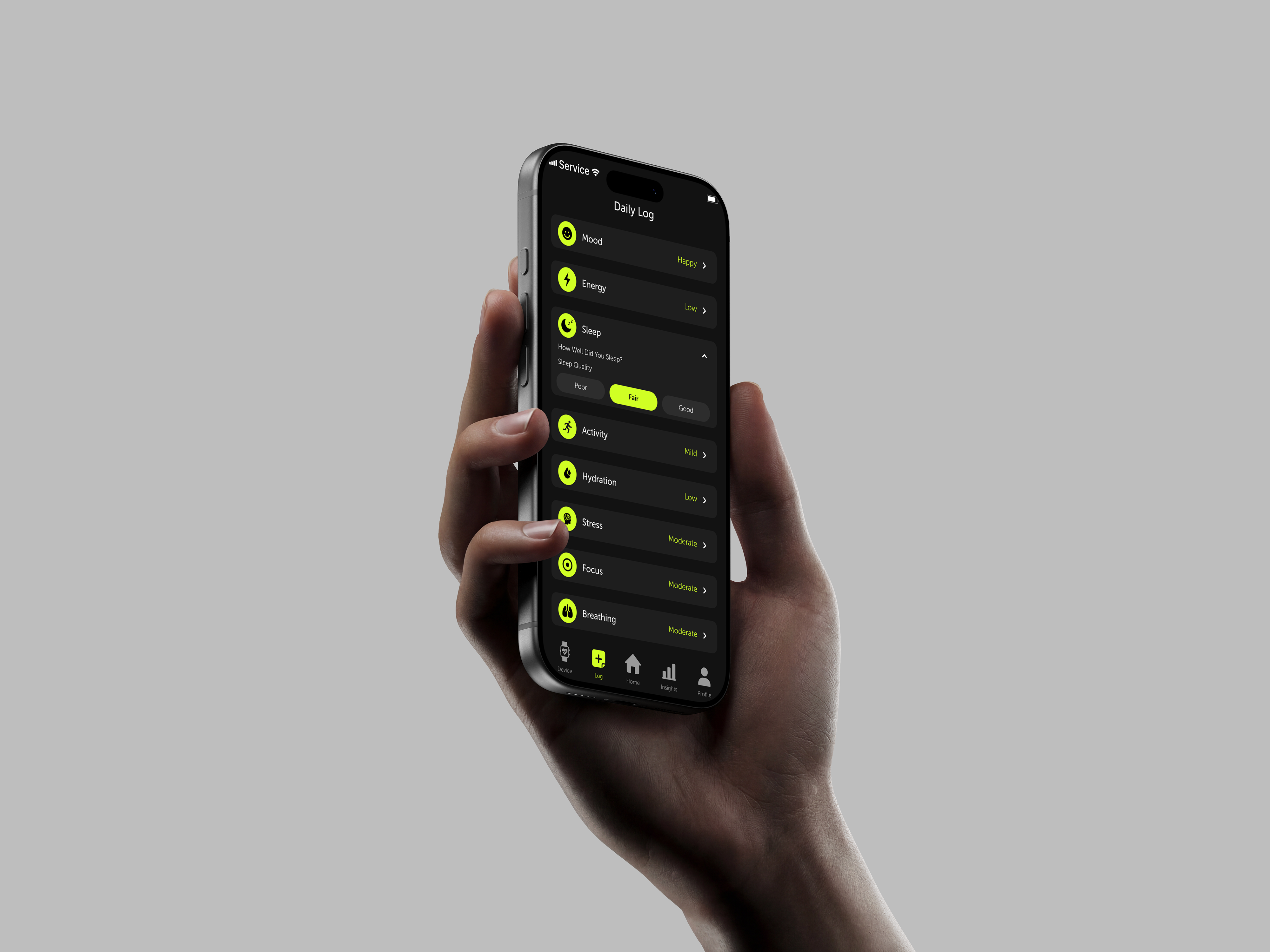
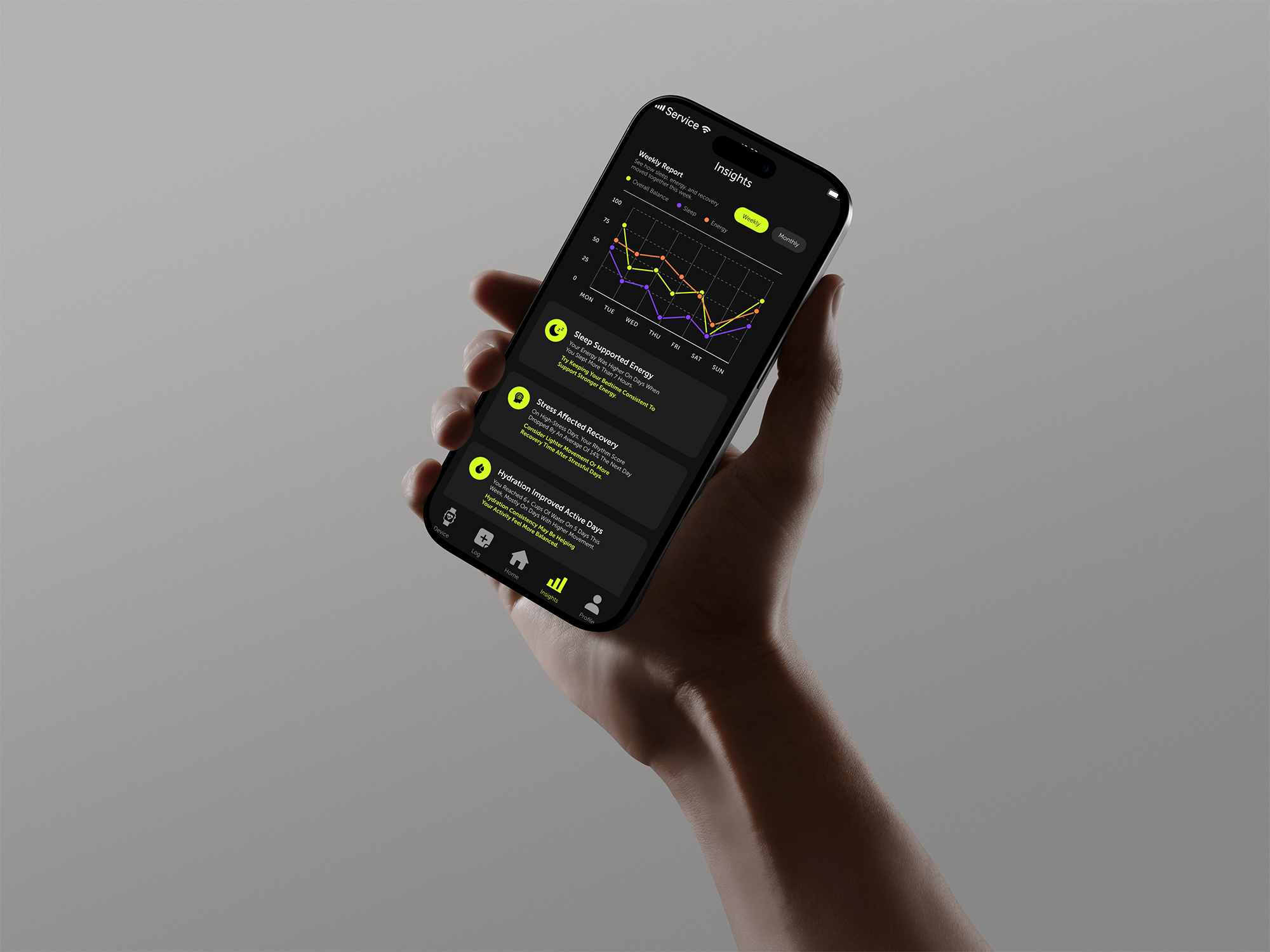
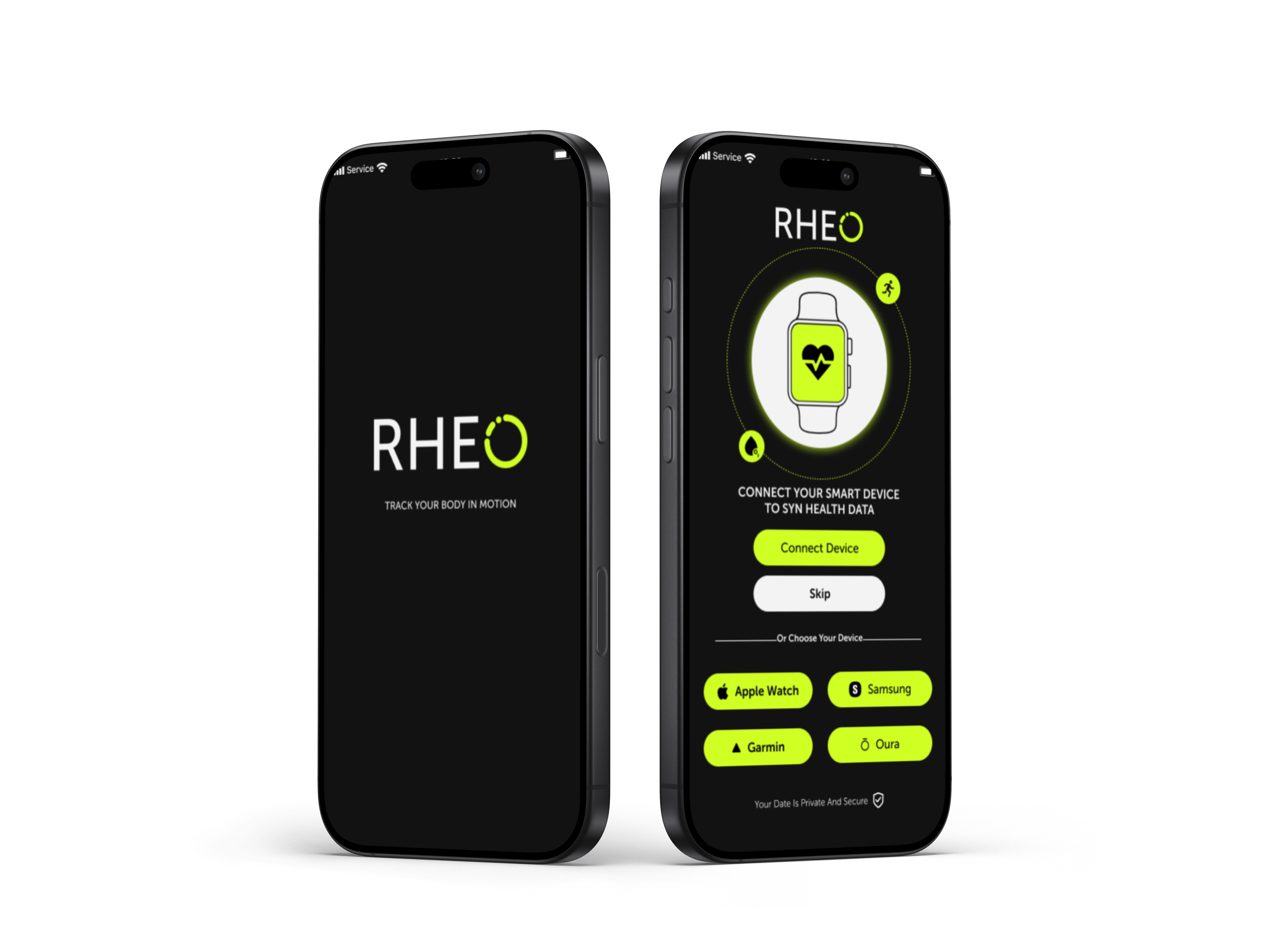
The interface applies the brand to a wearable-connected experience: dark backgrounds, bright signal colours, circular indicators, and compact cards for sleep, energy, recovery, hydration, and activity — active and data-driven, but easy to scan.
This is some text inside of a div block.
04
UI concept
The interface applies the brand to a wearable-connected experience: dark backgrounds, bright signal colours, circular indicators, and compact cards for sleep, energy, recovery, hydration, and activity — active and data-driven, but easy to scan.
This is some text inside of a div block.