Lattice Design System

Figma Design system
scalable
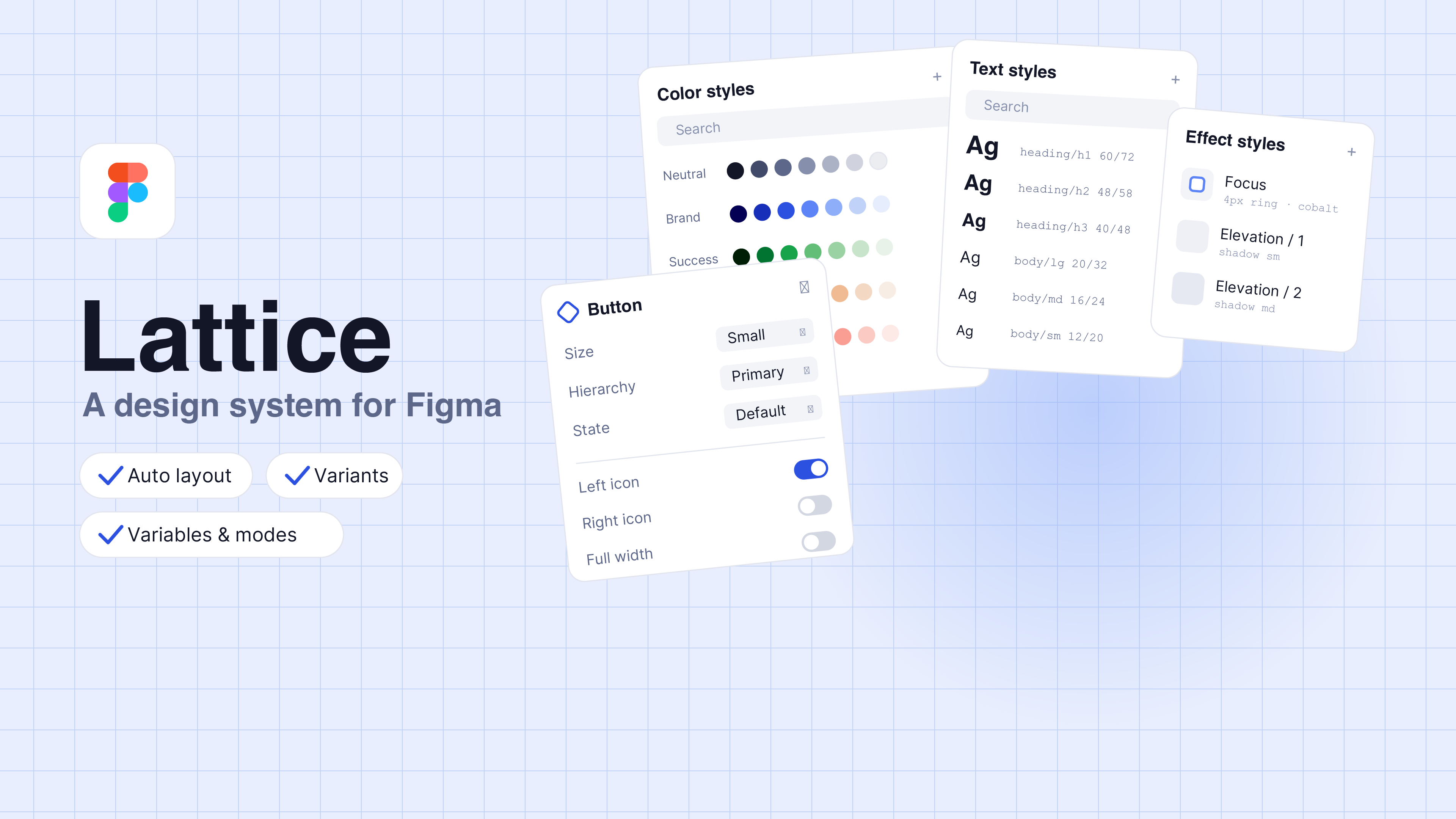
A scalable, token-driven design system spanning colour, type, and components, built to demonstrate advanced Figma in practice.
Role
Designer
Timeline
3 Weeks
Focus
Figma variables, aliasing, modes
Tools
Figma, Claude
7
Colour scales
9
Type styles
15
Components
3
Token tiers
Challenge
Ad-hoc styling doesn’t scale; values get hard-coded and theming becomes a manual hunt.
What I did
Built a full system in Figma. colour tokens, a type scale, and a component library, on a three-tier, atomic architecture.
Outcome
A consistent, mode-ready system where one change ripples through the whole library.
A design system isn’t a one-off screen. It’s a product that serves other products, so it has to be built to change without breaking.
01
Why I built Lattice
I wanted to build a design system the way a real product team would, not a page of pretty swatches, but a system engineered to scale and re-theme without breaking. That meant going past colour styles into the deeper Figma features that make a system durable.

The problem with ad-hoc styling is that values get hard-coded everywhere. A hex lives in a hundred layers; a rebrand or a dark theme becomes a manual hunt. Lattice is my answer: every value flows from one source, and meaning is separated from the value it happens to hold today.
02
Method: atomic design
Lattice follows atomic design, Brad Frost’s methodology that borrows from chemistry: atoms bond into molecules, and molecules assemble into organisms. Applied to interfaces, it gives a design system five stages (atoms, molecules, organisms, templates, and pages) for building UIs deliberately and hierarchically.

Crucially, it is not a linear checklist. It is a mental model for seeing an interface as a cohesive whole and a collection of parts at the same time, moving between the abstract (a single button) and the concrete (a full page in context) as you work.

This is where the tokens fit. Frost counts base styles like colour and type among the atoms, so Lattice’s token layer is not separate from atomic design; it is the atomic foundation, made systematic. Every molecule and organism draws from the same semantic tokens, which makes consistency structural rather than something you police by hand.
Lvl 1
Atoms
Base styles and elements such as colour, type, buttons, inputs
Lvl 2
Molecules
Simple groups that do one thing; a search field
Lvl 3
Organisms
Distinct sections such as a header, a card, a grid.
Lvl 4
Templates
Components in a layout; the content skeleton.
Lvl 5
Pages
Real content in place; where the system is tested.
A hierarchy and a mental model — not five sequential steps.
03
Architecture: three tiers, built as Figma variables
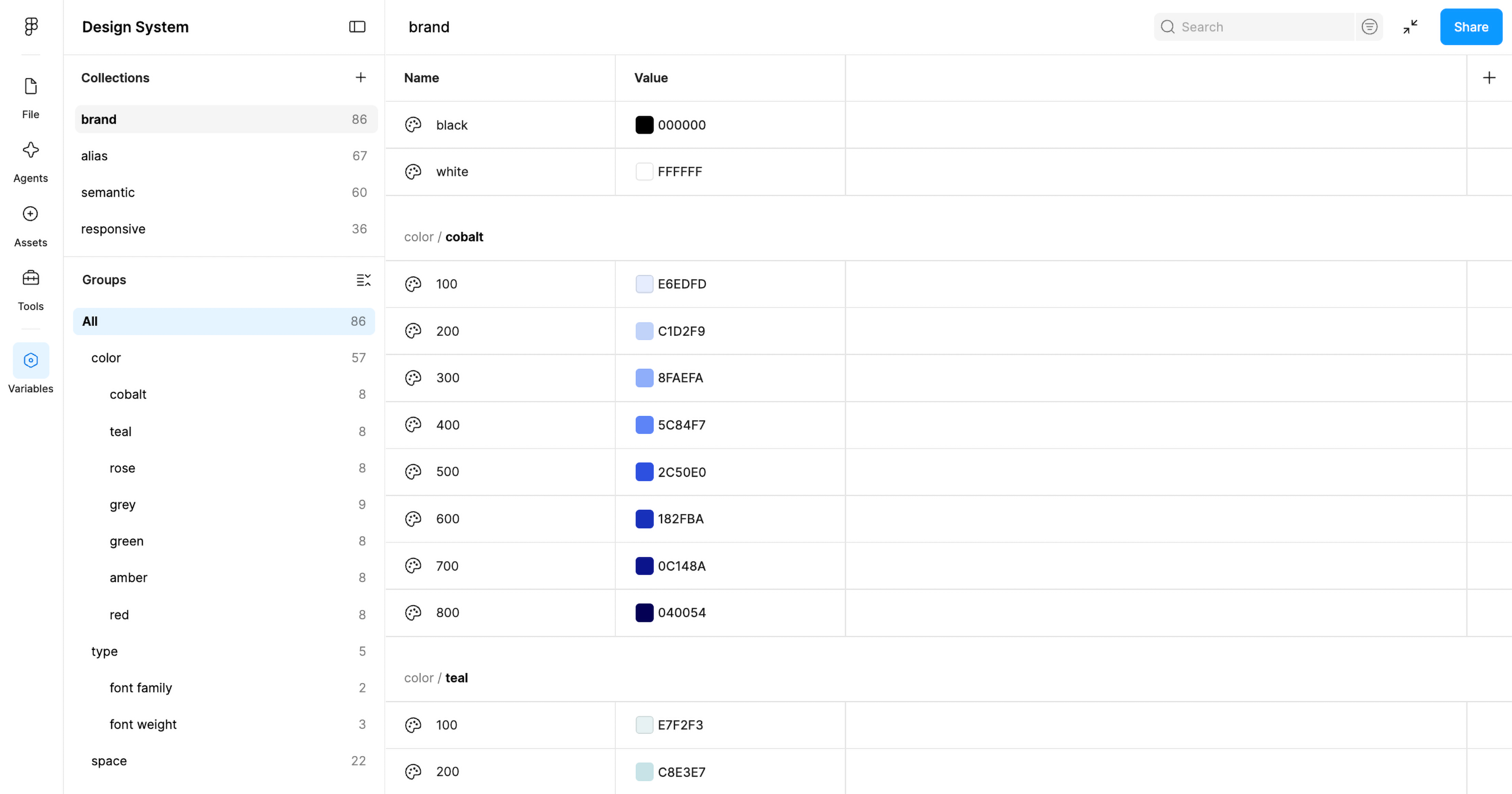
Beneath the atoms sits a three-tier token architecture, built as real Figma variable collections rather than colour styles. Each tier references the one beneath it through aliasing.
Tier 1 · Collection
Primitives
The raw scales, such as cobalt-500 and neutral-800. One source of truth, never applied directly to a layer.
Tier 2 · Collection
Semantic aliases
Roles that alias a primitive, such as action-primary or text-secondary. This is where intent is separated from value.
Tier 3 · Applied
Components
Layers and components consume semantic variables only, so nothing is ever hard-coded.
04
Color system, derived in OKLCH
The semantic layer is built as modes. Light is shipped; because every token is an alias, adding dark means one more column in the same collection — no component changes. It’s the planned next layer.
Cobalt
800
700
600
500
400
300
200
100
Teal
800
700
600
500
400
300
200
100
Rose
800
700
600
500
400
300
200
100
Neutral
800
700
600
500
400
300
200
100
Green
800
700
600
500
400
300
200
100
Amber
800
700
600
500
400
300
200
100
Red
800
700
600
500
400
300
200
100
05
Built for modes
Seven scales, eight steps each, derived in OKLCH so the steps are perceptually even. The jump from 400 to 500 feels the same across every hue, and contrast stays predictable wherever a token lands.
05
Typography system
The type layer carries the same rigour as colour: two families, a weight scale, and a full set of named text styles from heading/h1 down to body/sm.
Heading
Poppins
Regular 400 · Medium 500 · Semibold 600 · Bold 700
Tier 2 · Collection
Inter
Regular 400 · Medium 500 · Semibold 600
heading / h1
The quick brown fox
PoppinsSemibold60 / 72
Hero titles and primary page headings.
heading / h2
The quick brown fox
PoppinsSemibold48 / 58
Main section titles.
heading / h3
The quick brown fox
PoppinsSemibold40 / 48
Subsections and feature groups.
heading / h4
The quick brown fox
PoppinsSemibold32 / 40
Card titles and smaller content blocks.
heading / h5
The quick brown fox
PoppinsSemibold24 / 30
Card titles, groups, and compact sections.
heading / h6
The quick brown fox
PoppinsSemibold20 / 26
Small titles, labels, and supporting hierarchy.
body / lg / regular
The quick brown fox jumps over the lazy dog.
InterRegular20 / 32
Lead paragraphs and intro copy.
body / lg / semibold
The quick brown fox jumps over the lazy dog.
InterSemibold20 / 32
Emphasis inside lead paragraphs.
body / md / regular
The quick brown fox jumps over the lazy dog.
InterRegular16 / 24
Default paragraph text and component descriptions.
body / md / semibold
The quick brown fox jumps over the lazy dog.
InterSemibold16 / 24
Inline emphasis in running text.
body / md / link
InterRegular16 / 24Underline
Links inside running text.
body / sm / regular
The quick brown fox jumps over the lazy dog.
InterRegular12 / 20
Captions, helper text, and metadata.
body / sm / semibold
The quick brown fox jumps over the lazy dog.
InterSemibold12 / 20
Small emphasis, labels, and metadata.
body / sm / link
InterRegular12 / 20Underline
Links inside captions and fine print.
06
A component library
More than a single button: a real library, with each component assembled from token-bound atoms using component properties, variants, and auto layout. Every one is styled only from semantic tokens, so it re-themes for free.
07
What it enables
Change a token once, and it updates everywhere.
A shared map
The team gained a common picture of a noisy market and a vocabulary for weighing trade-offs.
Decision-ready frameworks
The analytical models gave the team a defensible basis for choosing a direction, not just data.
From exploration to build
The client committed to a direction and has since moved into developing the product — carrying the positioning and experience priorities forward.
09
Reflection
Building Lattice pushed me past surface-level Figma into the mechanics that make a system a product: variable collections, aliasing, and a mode-ready structure. The biggest shift in my thinking was learning to name intent rather than colour. Once a token means action-primary instead of “blue,” theming, scaling, and hand-off all become easier.