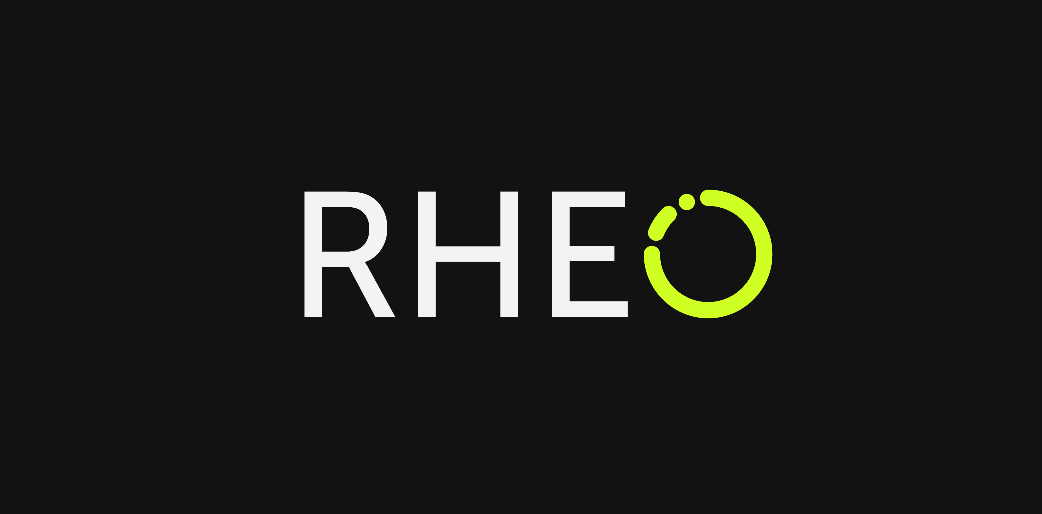
RHEO
Health Tracking App Branding &
UI Concept
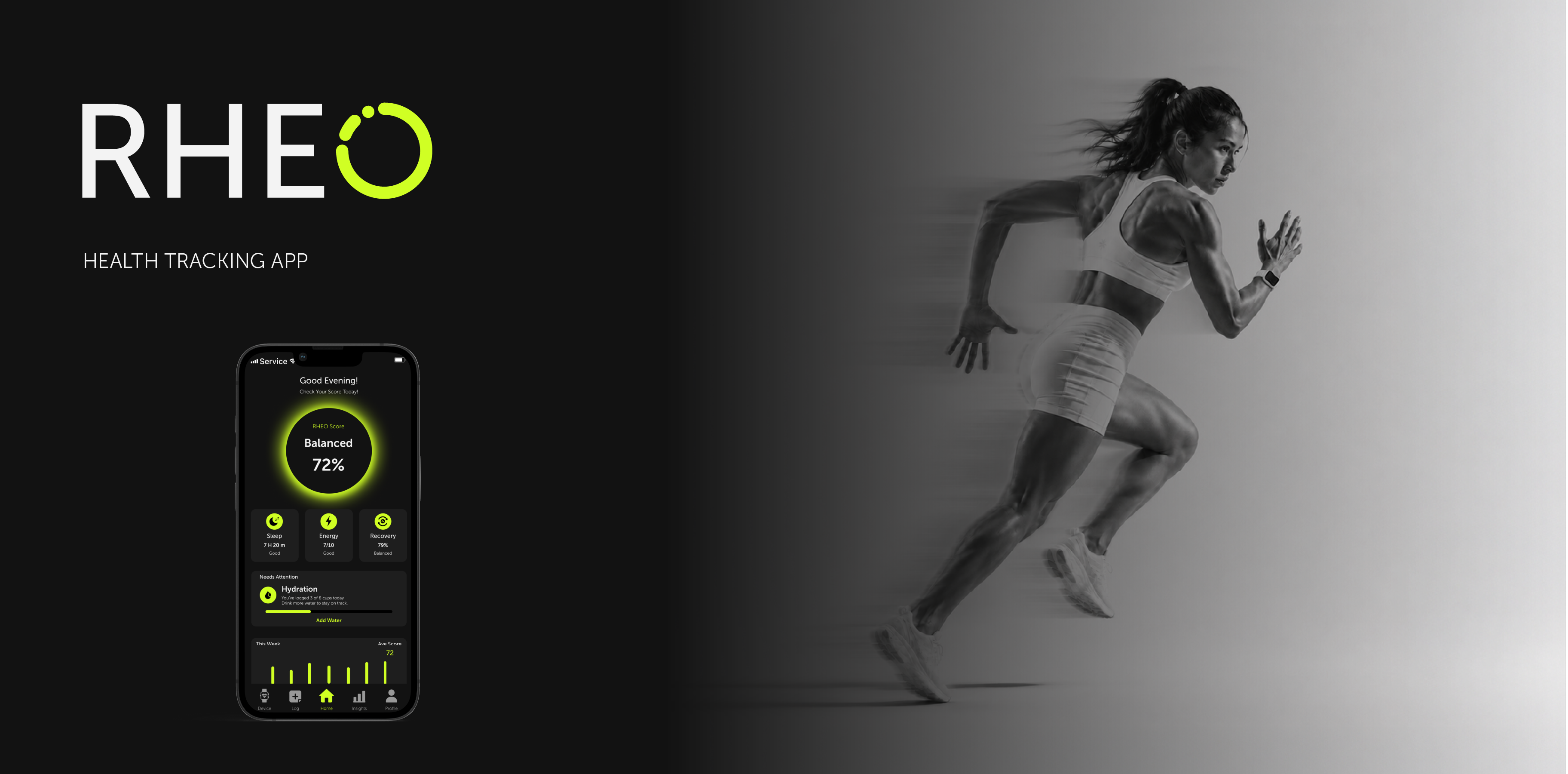
TO CREATE A BOLD BRAND IDENTITY AND MOBILE UI CONCEPT FOR A HEALTH TRACKING APP THAT HELPS ACTIVE USERS UNDERSTAND THEIR BODY, MOVEMENT, AND DAILY PERFORMANCE SIGNALS.
Health tracking apps often show numbers for sleep, recovery, hydration, or activity, but those numbers do not always help users understand how their body actually feels in motion.
RHEO was designed to move away from soft wellness aesthetics and cold medical dashboards. The challenge was to create a health tracking identity that feels energetic, clear, and connected to movement, while still keeping the information easy to read.

The RHEO logo was built around the idea of flow, rhythm, and continuous movement. Since the name suggests motion and circulation, I used a circular form as the foundation of the mark.The broken circle creates a sense of energy and progression rather than a static symbol. It suggests body signals in motion, ongoing tracking, and the way health data changes throughout the day.
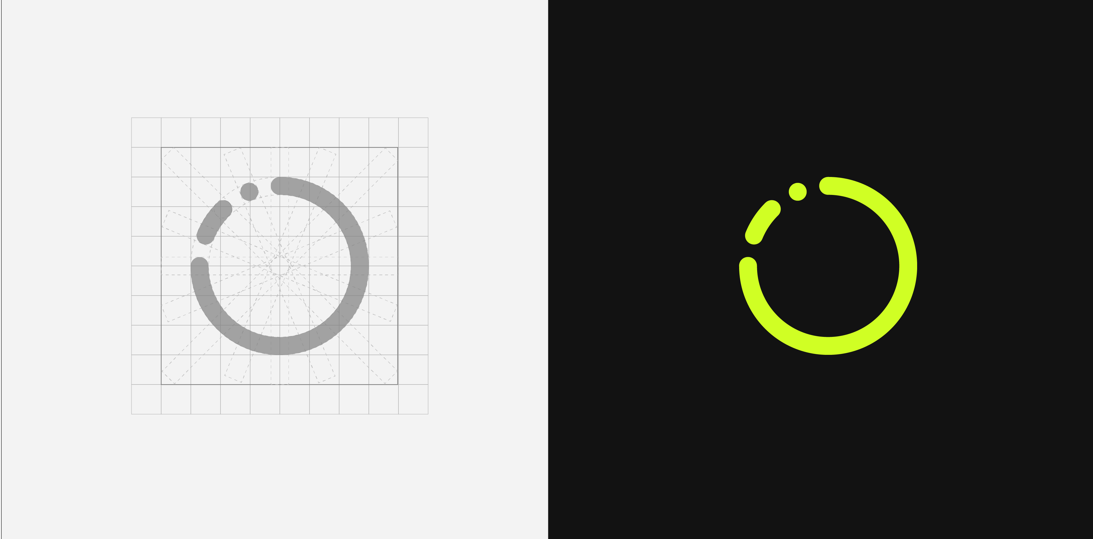
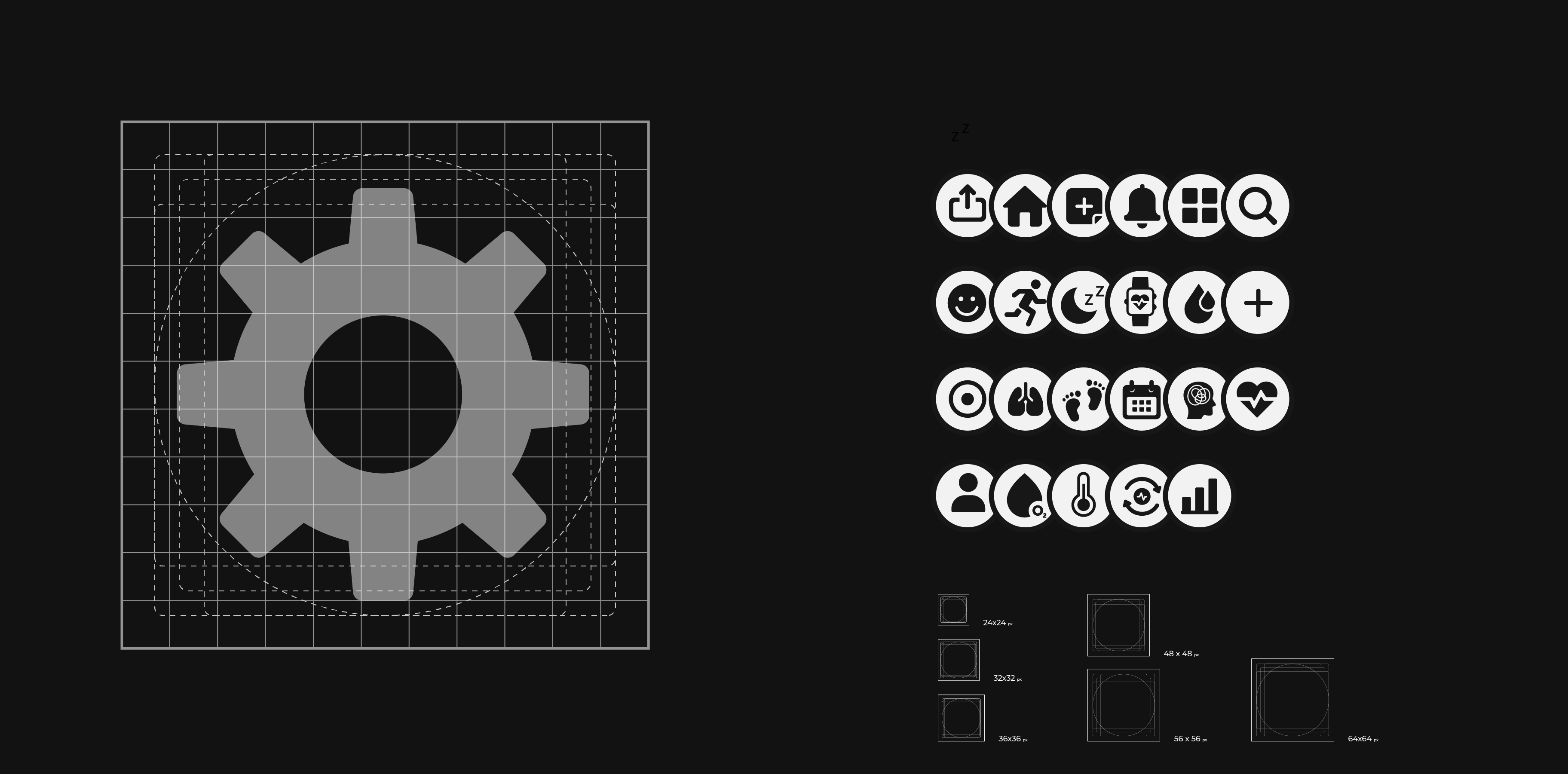
The mark was refined through a geometric grid to keep the shape balanced, scalable, and consistent across different sizes. The circular structure helped create a strong visual connection between the brand name, the product concept, and the app’s focus on movement-based tracking.The final form is simple enough to work as a logo, app icon, and interface element, while still carrying the feeling of motion and activity.
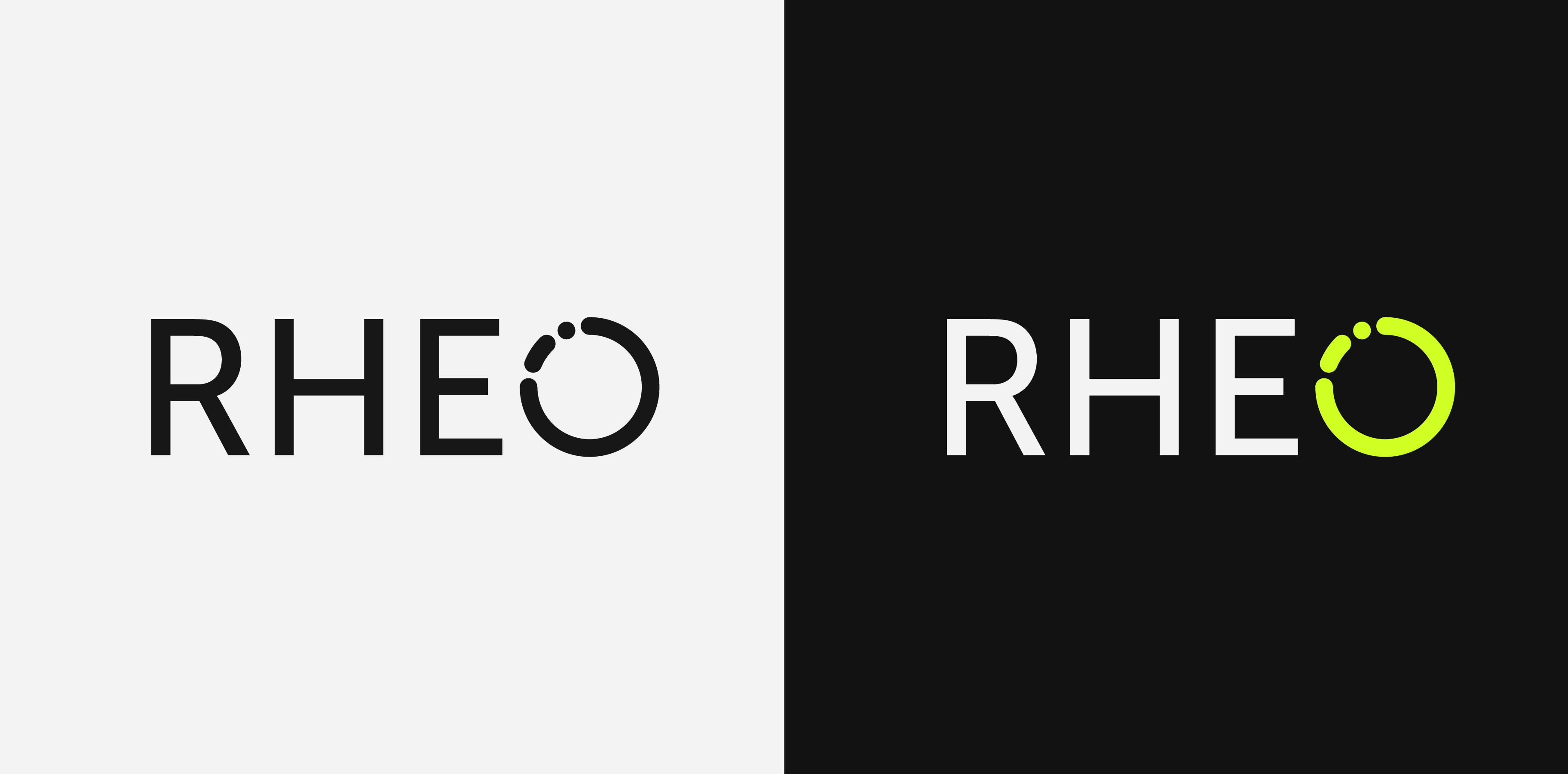
The RHEO logo was designed to work across both light and dark backgrounds while keeping the same bold, high-contrast identity.On light backgrounds, the logo uses a black wordmark and mark for strong readability and a clean, minimal look. On dark backgrounds, the wordmark shifts to white while the circular mark keeps the neon green accent, creating a stronger connection to the app’s energetic digital interface.These variations allow the identity to stay consistent across different brand applications, from presentation layouts and app screens to marketing assets and mobile mockups.
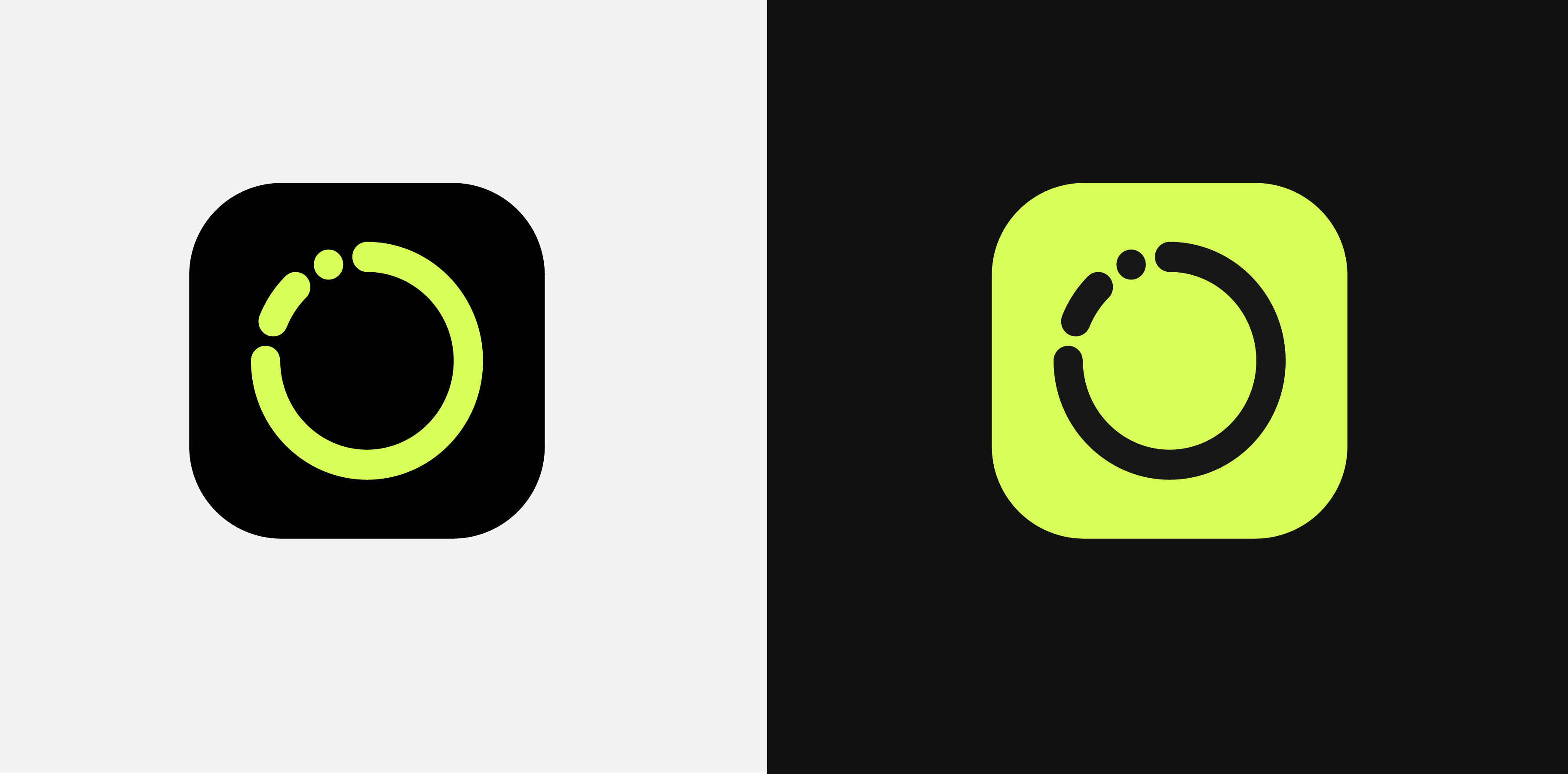
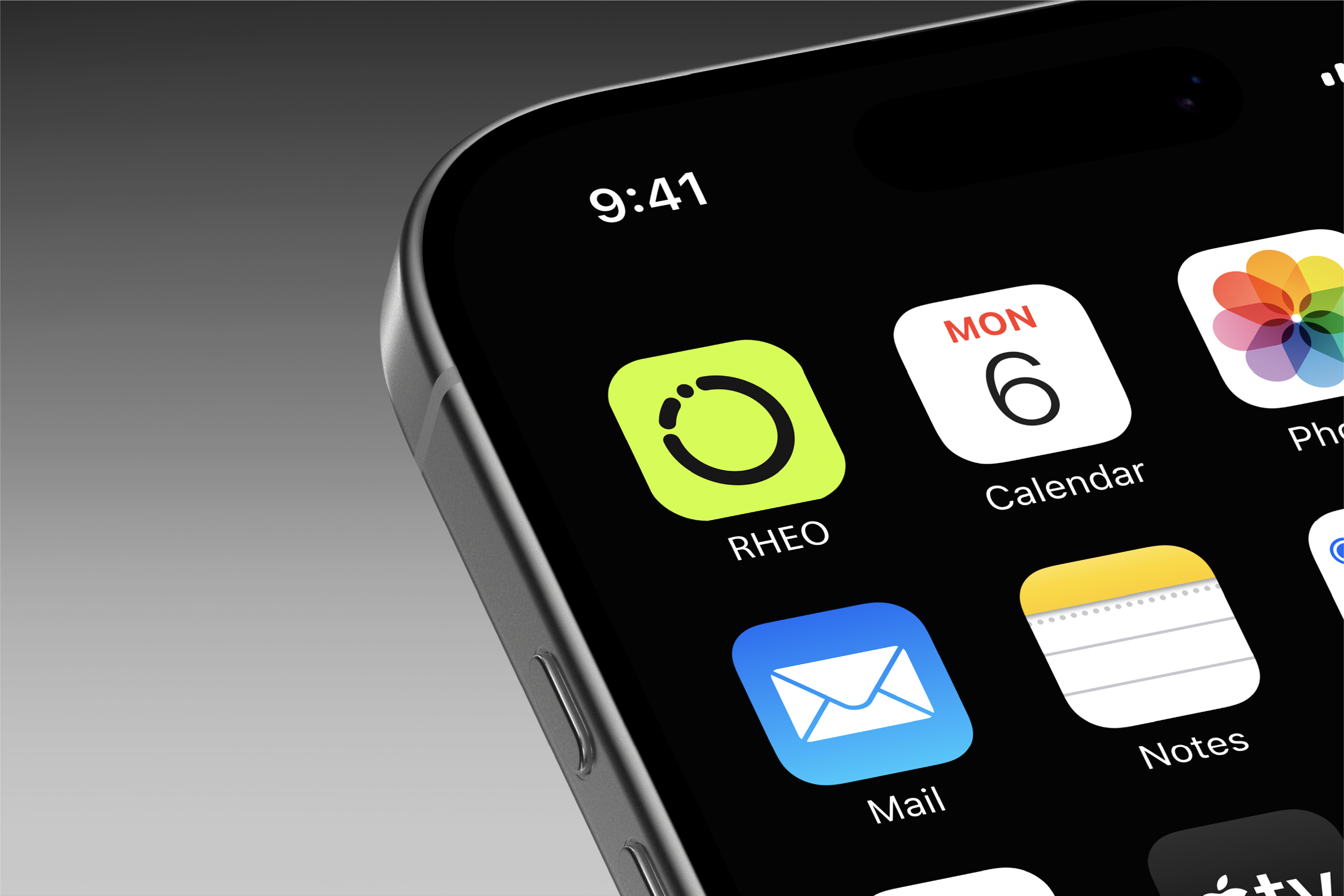
The logo mark was adapted into an app icon using the same circular language and high-contrast colour system. The neon green gives the icon strong visibility on a dark mobile screen, while the rounded form keeps it aligned with the app’s interface style.This visual system was also extended into the icon set, where circular containers, bold shapes, and simplified symbols create consistency across the mobile experience.
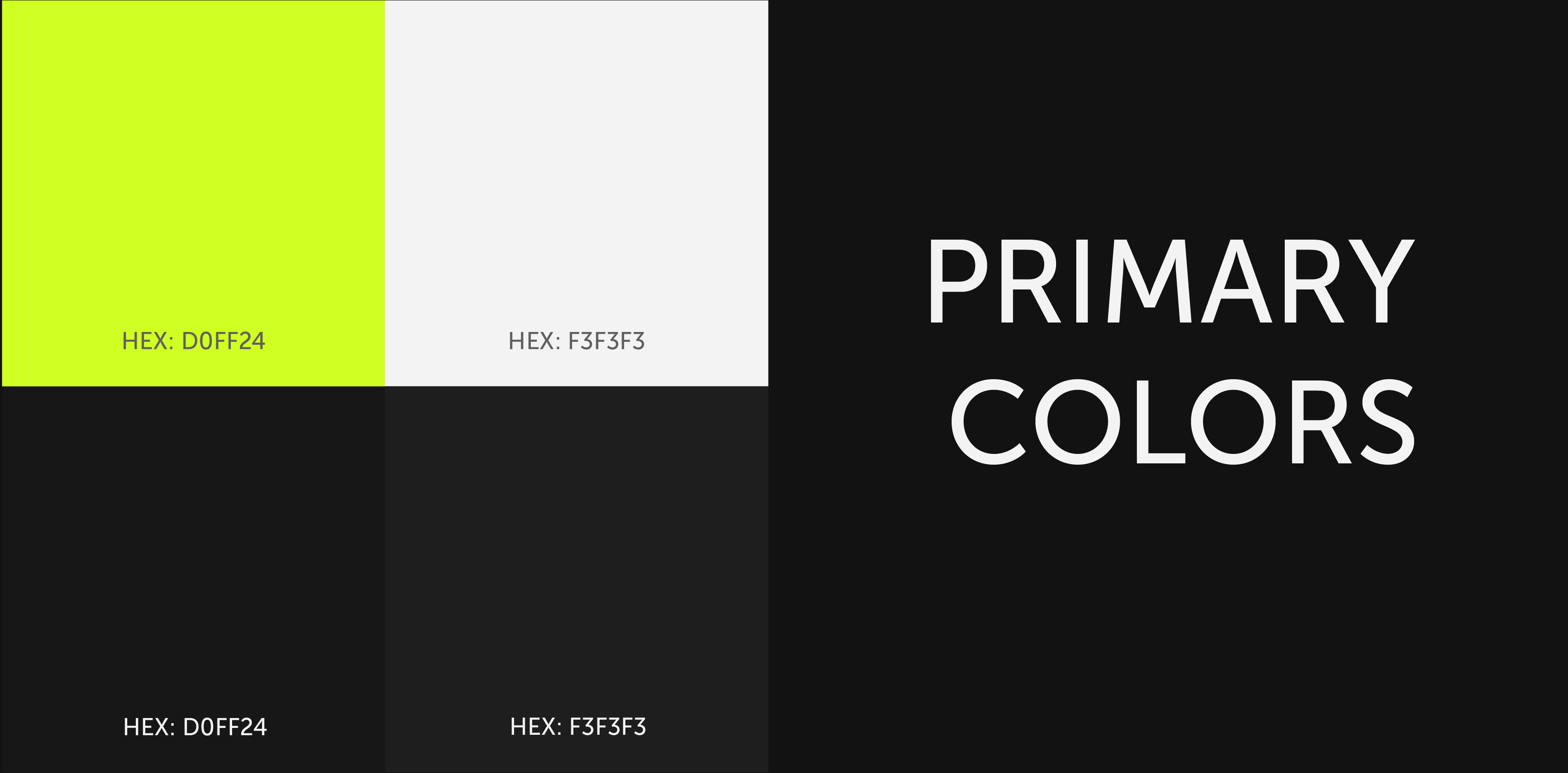
The colour palette was built around high contrast. Black creates a focused digital environment, while white supports readability and neon green brings energy, visibility, and a sense of performance.The neon accent acts as the main signal colour across the brand, guiding attention to key actions, scores, icons, and important health indicators.
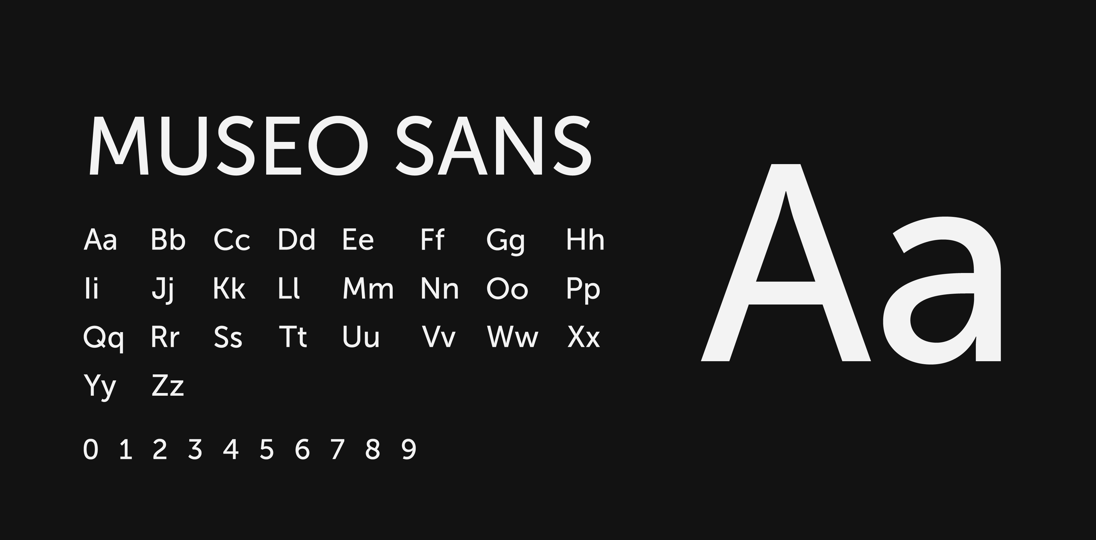
Museo Sans was selected for its clean, modern, and geometric character. Its rounded forms support the circular identity of the brand, while its strong readability makes it suitable for health data, dashboard labels, and mobile UI.The type system was kept simple to support quick scanning, especially in screens where users need to read scores, signals, and short insights at a glance.
The icon system was designed to extend RHEO’s circular visual language into the mobile interface. Each icon sits inside a rounded container, creating a consistent structure across navigation, health categories, device settings, and dashboard actions.The icons use bold, simplified forms to support quick recognition at small sizes. This was important for a health tracking app, where users need to scan information quickly while moving between signals such as activity, sleep, breathing, hydration, recovery, and overall progress.
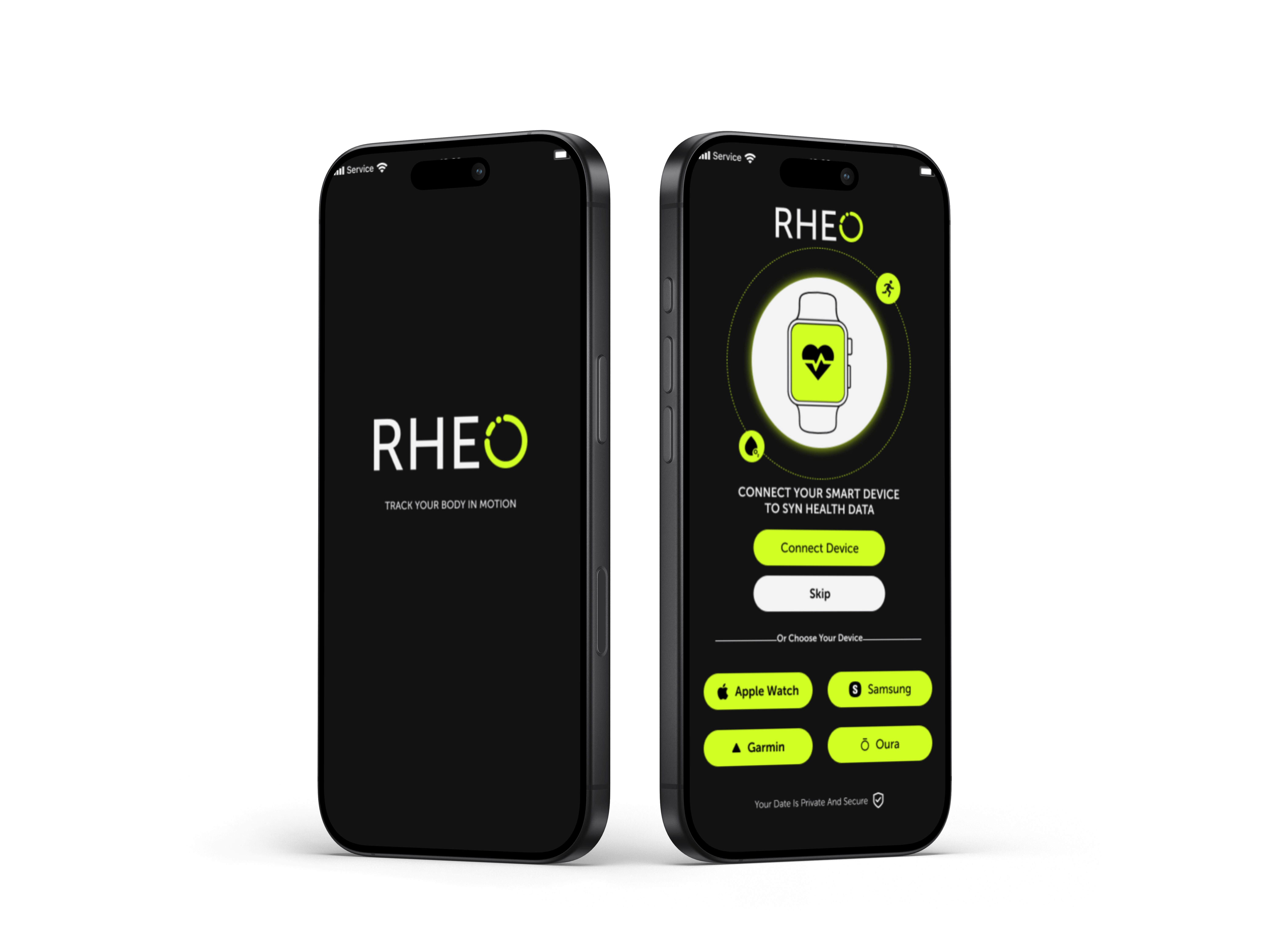
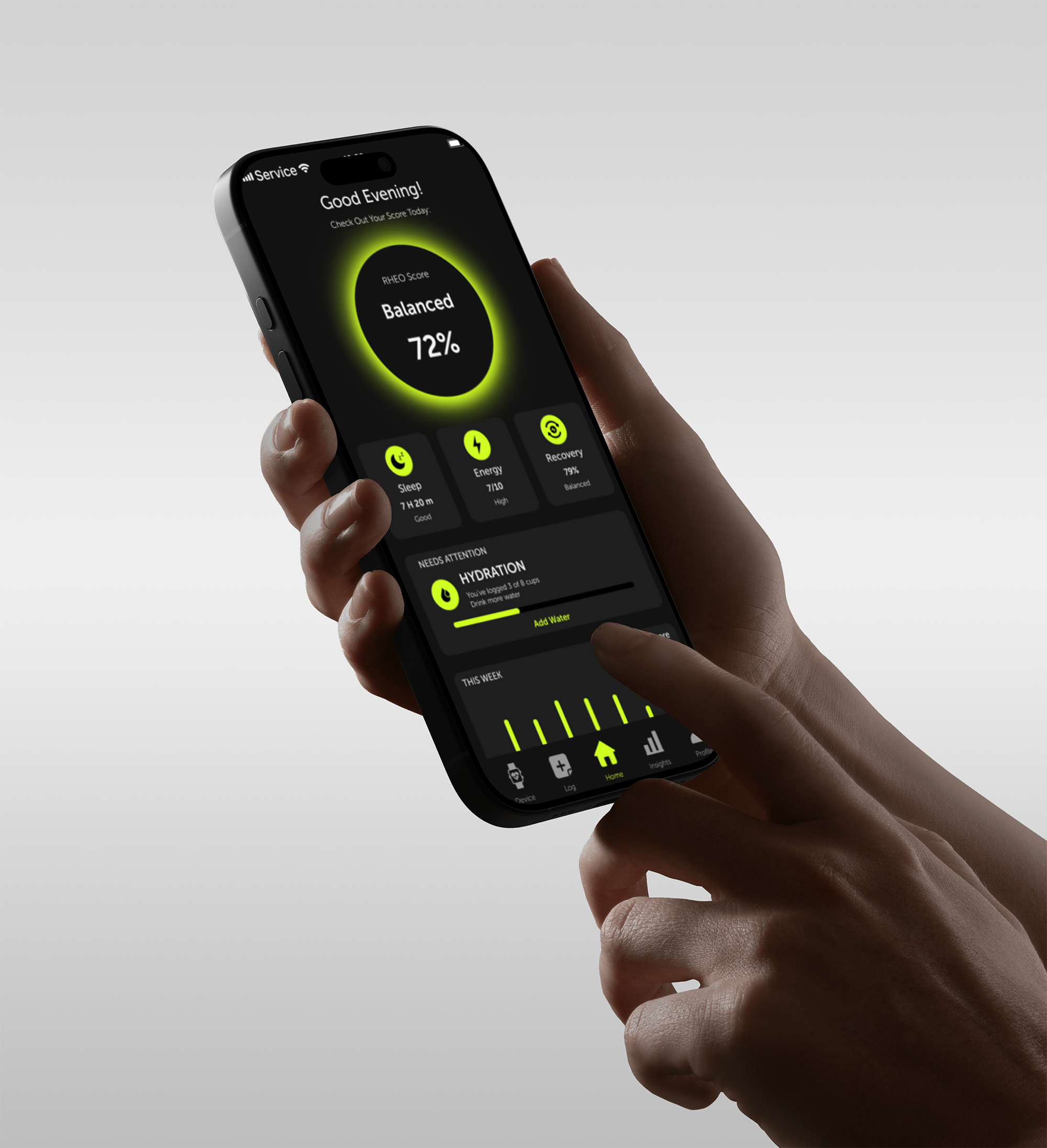
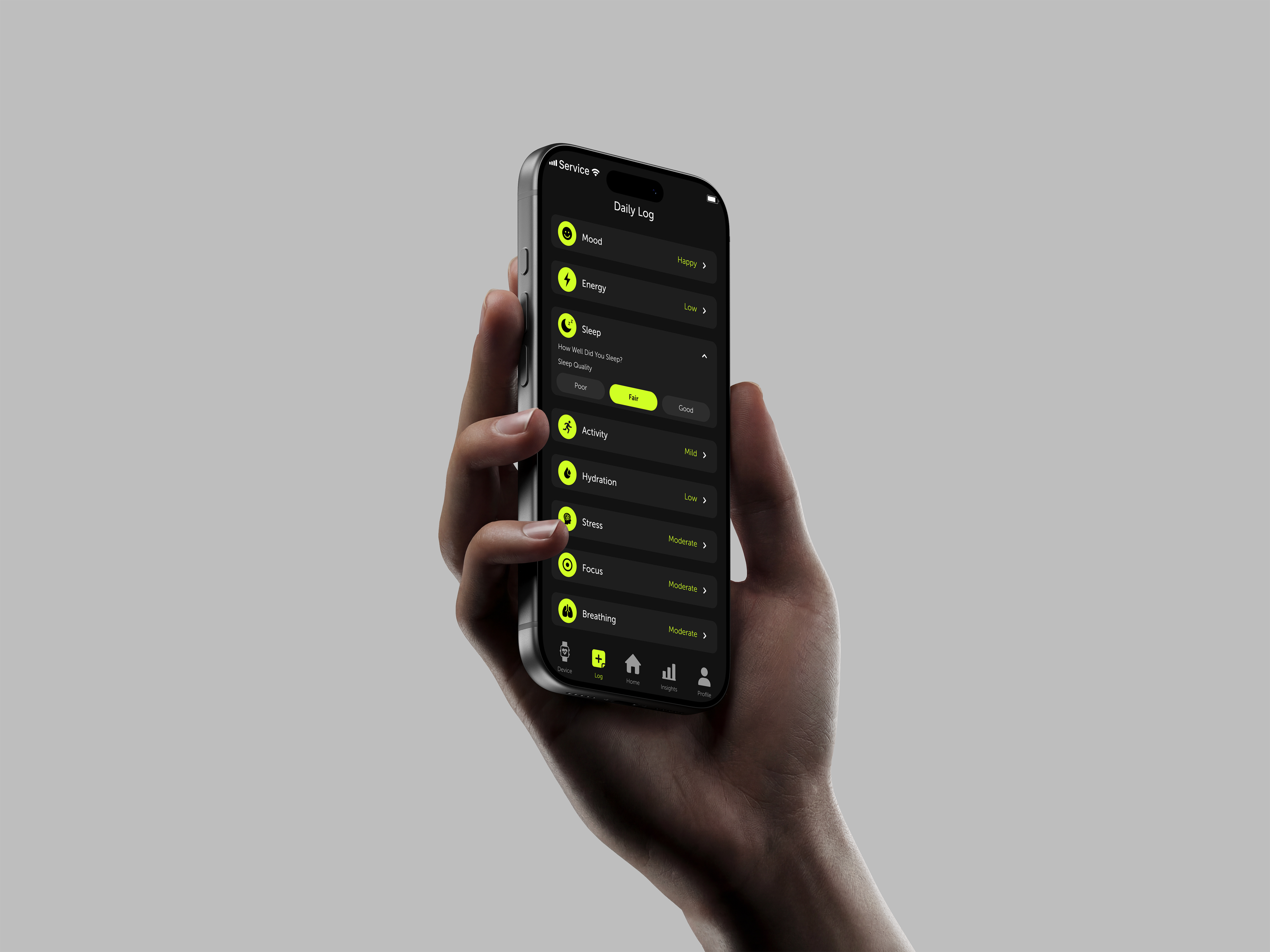
The mobile interface applies the brand system to a wearable-connected health tracking experience. The screens use dark backgrounds, bright signal colours, circular indicators, and compact cards to organize information such as sleep, energy, recovery, hydration, and activity.The goal was to make the interface feel active and data-driven, while still keeping the user experience clear and easy to scan.
The homepage introduces selected tours, destinations, accommodations, and one-day activities, giving users a focused starting point instead of an open-ended search experience.
Listing and detail screens organize key information such as location, ratings, duration, price, and experience type, helping users compare options without relying only on endless browsing.
The booking flow connects detail review, payment, confirmation, and trip management, creating a clearer path from discovery to action.
This project helped me explore how branding can shape the way health data feels. A tracking app is not only about showing numbers. It also needs to create a sense of rhythm, motivation, and connection between the user and their body.
Through RHEO, I focused on building a visual system that feels active and confident while still keeping information clear and easy to scan. The project strengthened my ability to connect logo design, colour, typography, iconography, and UI into one cohesive product identity.